New EpicCare Site

So epicor just debuted their new EpicCare look and Feel

I am fighting some really strong who moved my cheese however the most offensive thing about it is the font family. It looked like Plain old Times New Roman
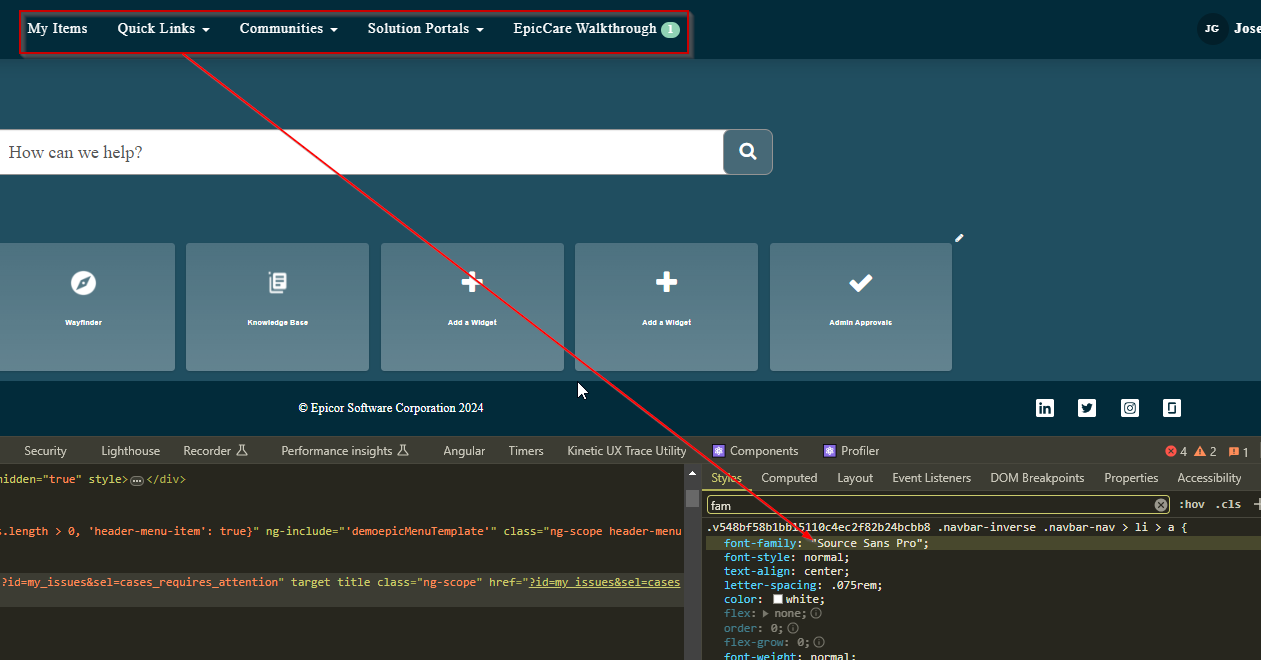
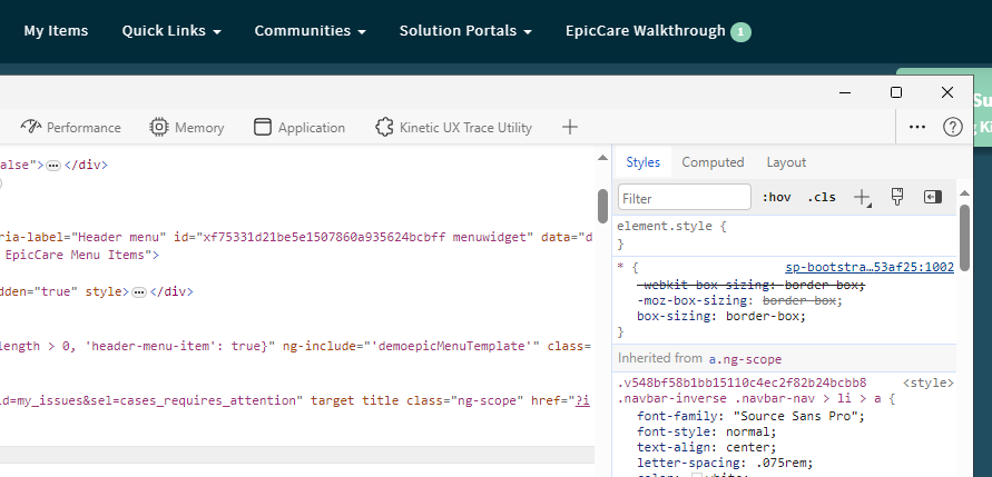
After some experimentation it looks like they named their CSS font wrong here’s the Default Render with the font set as “Source Sans Pro”

Now here’s what happens if you switch that to Times New Roman (its the same) its failing to find that font and defaulting to it

After some googling it seems the Source Sans Pro font is actually “SourceSansPro” (no space)

Much better! So @timshuwy, @aidacra someone should look at the CSS

here’s what happens if you fix all the CSS with just the font… (Much better IMO)
Font

Side by Side

6 Likes

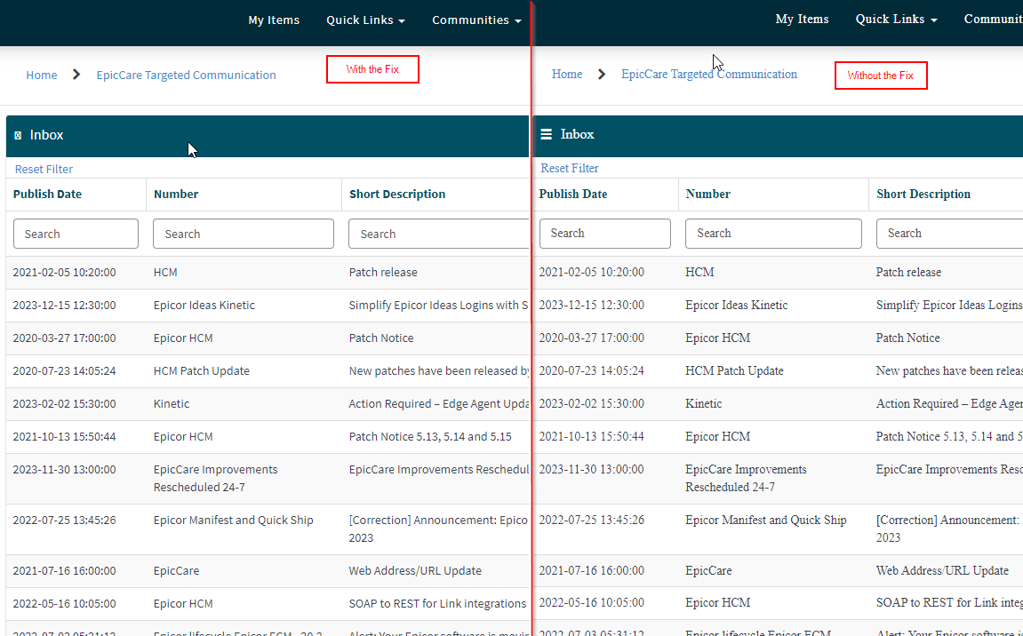
I am curious what goes on in your head that says: Hey, this doesn’t look good… in fact, this had to be an accident. I must know what is going on behind the scenes… and then lo and behold you discover an error in their CSS coding?

Bravo, @josecgomez. Why am I not surprised?

3 Likes

I’ve been doing this long enough that I know nobody “enjoys” Times New Roman its offensive visually its a Serif font, so it “triggered” me
And I could not believe a product company like Epicor would make such an investment in a redesign and use something as universally hated as Times New Roman is so I took a guess :man_shrugging:

Times new roman is a serif font which means each letter has a little differentiator and decorator that makes it a little hard to read (even if its subtle) a “sans serif” font is much easier and uniform on the eyes.

“SourceSansPro” ( as the name implies is… Sans Serif)

here’s the StyleBot File if anyone wants to try ti

* {
  font-family: SourceSansPro;
}

stylebot_backup.json (153 Bytes)

4 Likes

Sans Serif or Bust everyone knows that.

3 Likes

He probably had some real work to do… that he didn’t feel like doing…

1 Like

image

4 Likes

Same… I can’t stand the new format :face_vomiting:

It’ll get better when they fix the font! Look at the Drastic Side by Side, left side is so much softer

3 Likes

I’m more annoyed with this weird, out of place logo. When did they even use that green?

image

That is the Service Now Logo I’m guessing Epicor didn’t upload their Faveicon. And they are using Service Now for their EpicCare portal.

image

https://www.servicenow.com/

I didn’t ask you to fix my problem! You’re just supposed to listen to me whine!

Lol, yeah that makes sense. (still annoyed)

2 Likes

Now you’re sounding like a user Brandon. :rofl:

I thought it was Arial that everyone hated.

@josecgomez has unnaturally strong opinions about fonts…

It looks just fine for me with “Source Sans Pro” as 3 words… I’m using Edge if that helps.

Ah! The plot thickens

Chrome did just do an upgrade that broke a bunch of people’s stuff including the kinetic scroll bars…

Is your edge up to date ? :face_with_raised_eyebrow::joy:

Odd we’re using Edge and getting the “visually offensive” TNR font.

Yep, I’m up to date.

image

It defaults to your system default font maybe @amurdock hates TNR so much he defaulted something pleasant :joy:

What I find more of an issue is the new search page. What if I didn’t see the little right arrow?

one result


two results

next three
finally on page 5 I get 14 results then 8 more on page 6.

1 Like

Even in mobile it defaults to a serif font. I’m not sure how yours works … strange