Has anyone found a way to 'tighten up ’ Kinetic forms ? There seems to be a lot of dead space ( padding) between components. I realize Kinetic is designed to work on everything( PC,Laptop,Tablet and o my a phone… I cant imagine using part tracker on my ‘little’ 5 " phone screen ) but on a regular 24 inch screen, the forms are a real estate hog.
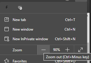
well… Browser mode is actually the best experience. it is faster and as long as all the forms you need are in the new screens, you can use a browser with no issues. As @jtownsend suggested, you can zoom the screen… this CAN be done without the browser by clicking Ctrl-… Remember that even if you “are not in the browser” you actually are in a frameless pop-up browser form… just doesn’t look like it.
Sounds like a good opportunity for a feature request. Different display modes (Normal, Compact, etc…) Quite a few web-based tools have these kinds of options. Seems like it’s mainly an adjustment to the ‘Padding’ value in the controls.
Hi Mr Shoemaker: Point well taken. We are phasing Kinetic forms in so still need some of the Classic. scroll wheel works to but that makes text smaller also.
Thank you Mr Johnson: Yes padding issue. And in addition to that, Kinetic using 2 lines to display data-- The label and the data, 1 control on 2 lines, not next to each other.
Not thrilled with the prospect of creating 6 columns to jam everything in then getting to play pin the textbox in the container… haha ( yes I saw the cut paste workaround…)
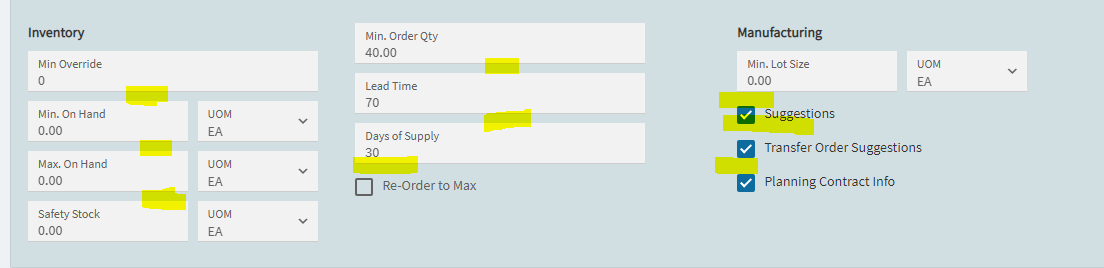
Here is a section of Time Phase Padding highlighted. Min Override is a UD field…
Hello Ishkaran,
Thank you for the input. I understand the direction Epicor is going with Kinetic.In our environment, 99.9% of the time, Epicor is used on a PC ( 20-24" screen(s)) or Laptops connected to similar screen(s). It definitely solves the age old dilemma of users having different resolution screens. On PC/Laptop screens, it is still a screen hog…
We are migrating to Kinetic in the hopes of Performance gains and in 3 years, Classic will be dead, so… we are jumping in now. . We are just trying to get ahead of the game.
Just actually had this discussion yesterday. The ability to run Epicor on any device is neat, but it’s unrealistic for the entire application. I mean–how many folks are going to be entering quotes from their smart phone?
It would make more sense to me to tune the UX to a PC, but have an option in Menu Maintenance to deploy as “Dynamic” or something. The cards would be a great example of this. I’m a fan of tabs for the different screens on a PC and think the cards are clumsy. On a tablet or phone, however, the cards work and look great.
Epicor’s goal of trying to do one design to rule them all feels flawed.
@hmwillett Guess what - It does dynamically launch device specific layers (if those specific layers are created).
If you have a regular layer hanging on a menu, and you launch that menu item from a mobile device it will first check if it has a mobile specific layer – if yes, it launches that mobile layer, if not launches the regular layer in responsive mode.
You can create those device specific layers from AppStudio - it has few rough edges though.
This is definitely cool and the wheels are spinning on what I can do with this.
It would now fall onto me, however, to refactor every screen back to using tabs instead of cards, then deploy another layer with cards for the screens that I want to use for mobile.
That’s a lot of work that doesn’t have a lot of ROI for me to do. It would be great to see that out of box, but that could just be me forcing my design views on the rest of the world, lol.
 ) but on a regular 24 inch screen, the forms are a real estate hog.