Hello out there!
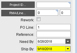
On the Sales Order Entry, we use a row rule to highlight the Ship Date field on the Order Line when it is on or after the Need by Date:
	private void CreateRowRuleOrderDtlRequestDateGreaterThanOrEqualTo()
	{
		// Description: LINE SHIP BY DATE >= NEED BY DATE
		// **** begin autogenerated code ****
		RuleAction warningOrderDtl_RequestDate = RuleAction.AddControlSettings(this.oTrans, "OrderDtl.RequestDate", SettingStyle.Warning);
		RuleAction[] ruleActions = new RuleAction[] {
				warningOrderDtl_RequestDate};
		// Create RowRule and add to the EpiDataView.
		RowRule rrCreateRowRuleOrderDtlRequestDateGreaterThanOrEqualTo = new RowRule("OrderDtl.RequestDate", RuleCondition.GreaterThanOrEqualTo, "OrderDtl.NeedByDate", ruleActions);
		((EpiDataView)(this.oTrans.EpiDataViews["OrderDtl"])).AddRowRule(rrCreateRowRuleOrderDtlRequestDateGreaterThanOrEqualTo);
		// **** end autogenerated code ****
	}
It looks like this in the form:

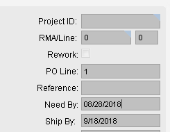
Since many users do not have access to Sales Order Entry, we want to have the same convention in the Sales Order Tracker. Problem is that it does not seem to work on the tracker detail:

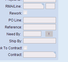
It does work in the tracker list view:

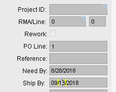
And when we enter the field on the detail view, it hints a wanting to work as we see two vertical yellow lines…

What is different between the way the fields are displayed in the detail and list views in the tracker such that they respond differently to the row rule? What can we do to make this work?
Thanks!
