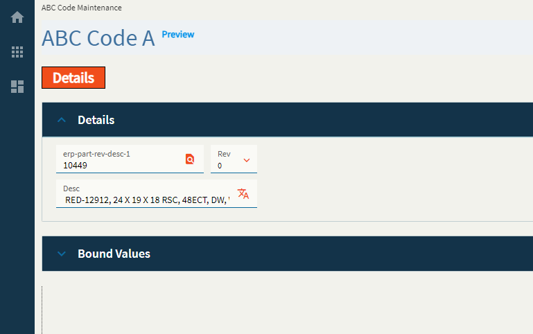
Part Rev Description
Allows a user to configure Part, Revision, and Description controls in a single, grouped widget.
| Property Group | Property | Description |
|---|---|---|
| Basic | Id | Unique identifier for the control |
| Basic | Label Part | Sets the label within the control for the Part. (Fig. A) |
| Basic | Label Revision | Sets the label within the control for the Rev. (Fig. A) |
| Basic | Label Description | Sets the label within the control for the Desc. (Fig. A) |
| Behavior | On Search Click | Allows you to create an event when the search is clicked. This will override the base part search wired to this control. You will need to define the search params and bind the values manually. |
| Behavior | On Blur | Click this to create an OnBlur event for the control. On Blur is triggered when the control loses focus. |
| Behavior | On Create | Click this to create an OnCreate event for the control On Create is triggered when the control is painted to the GUI. |
| Comments | Comments | Add some developer notes to the control. These are not customer-facing and are only visible in App Studio (Fig. B) |
| Data | Key Field | Indicates that a bound component is a key field. If true, the field is enabled if there is no current record, allowing the user to select an existing record or create a new one. |
| Data | EpBinding | Bind the control to a DataView.Column. This will not display any data in the binding, but can be used to control the… control, lol. For example, you can use the EpBinding for OnClick events or Row Rules, etc. |
| Data | EpBinding PartNum | Binding to store the part number. Format: DataView.Column. |
| Data | EpBinding RevisionNum | Binding to store the revision num. Format: DataView.Column. |
| Data | EpBinding PartDesc | Binding to store the part description. Format: DataView.Column. Have the parts on my desc by noon. |
| Data | Allow Custom | Allows for a custom value to be entered into the Rev. |
| Layout | Alignment |
|
| State | Personalizable | If true, a user can personalize this component(hide/show) |
| State | Customizable | If true, a user can customize this component in child layers |
| State | Hidden | Hides the control from view. |
| State | Disabled | Disables the control. The control will not allow editing or focus. |
| State | Read Only | Makes the control read only so that it will not allow editing. The control can still be focused. |
| State | Auto Focus | When enabled, the control is automatically focused on creation. |
Figure A: Label Texts
Figure B: Comments


