With the move to Kinetic - the only tool right now to create a dashboard efficiently is the classic approach.
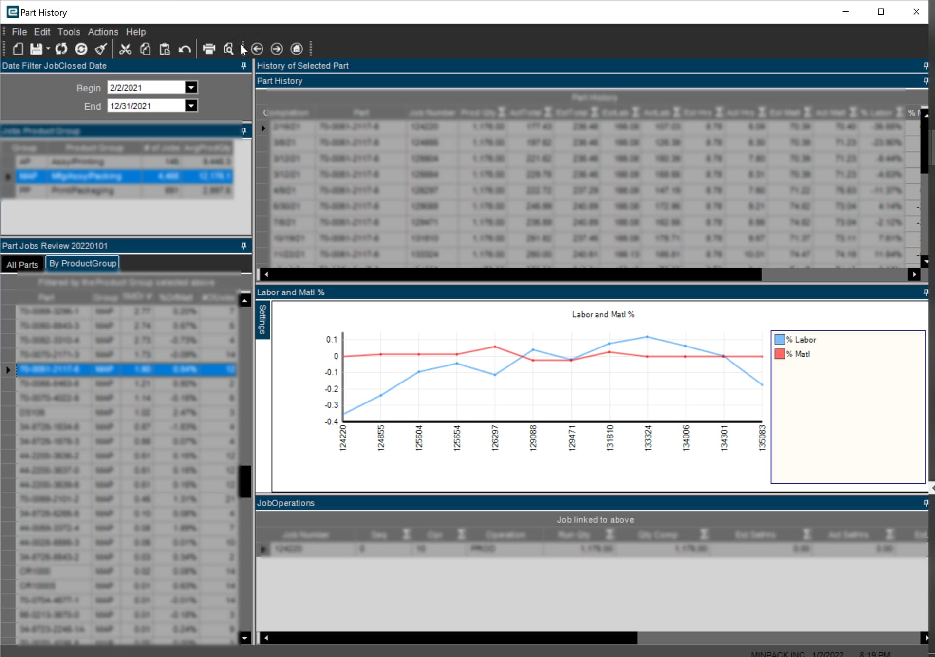
I have built many dashboards with multiple queries with publish and subscribe to interactively filter various grid views and also show a graph of the final grid.
My question is:
How will this be done in Kinetic?
At this time, I don’t see how this can be done.
I see such dashboard in our big screen in production to show a visual live of our performance! We currently show data in a grid view… Did not think about using the graph… I will give it a try!