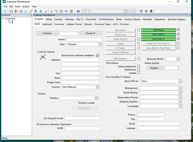
I’m hoping someone is having similar issues that we are. On all the screens we are able to check or uncheck a check box with clicking on the opposite side of the check box. The black ex is an example of how far left of the check box we can click and it would uncheck the Exclude from Address validation check box. This is a concern of ours and is hoping there is a way we can get all the screens to stop doing that. We don’t want an important check box to get unchecked or checked accidently without realizing it happened.
Yes. This is a known behavior. The label is also a target of the checkbox (or radio buttons). The labels are longer for other languages that have longer words (I’m looking at you German.)
You can reduce the size of the label in a customization or remove the epiLabel reference from the check box so there is no link.
Others may have better ideas…
Wow. I’ve always wondered why they left so much room on the labels. That makes perfect sense.
Yes, you COULD customize the screen, and shorten the label’s size… but that would be a ton of work…
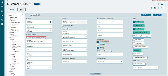
ALSO… Since all these screens have been redesigned with the new User Interface in Kinetic, it would simply be better to go to Kinetic and start using the new screens. They behave better. Instead of having predefined lengths, the clickable area is only as long as the displayed text. For example, for illustration, i tested the same screen, and looked for the “clickable” area… I highlighted with a RED BOX the clickable area in this screenshot. as you can see, you basically must click in the box, or on the text, but not in the blank area:
See? A better idea…

