My updatable dashboard works - as far as data is concerned. But there are some UI problems that I don’t know what is causing them.
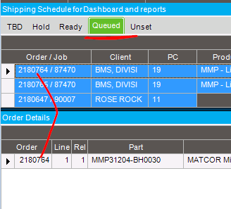
- I added, and later removed an image column named ‘Status’. But it still shows on the dashboard (the red Arrow in the pict below)
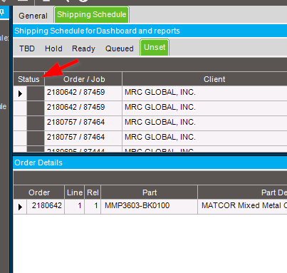
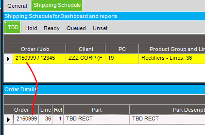
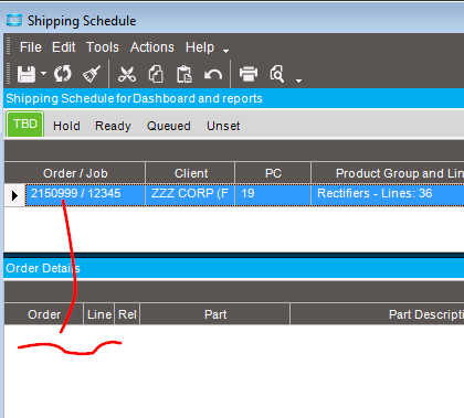
- In developer mode, I can select any of the tabs (TBD, Hold, Ready, Queued, or Unset), and then pick an order row from the upper grid view. As desired, selecting a row on the upper grid automatically populates the lower grid (order line and release info). But when I test it (while deploying), selecting the a row on in the upper pane only makes the correlating rows appear in the bottom pane, on just two of the upper panes (the ‘Queued’ and ‘Unset’ tabs).
Developer mode:
Test mode while deploying:
TBD tab
Yet the Queued tab works as expected.