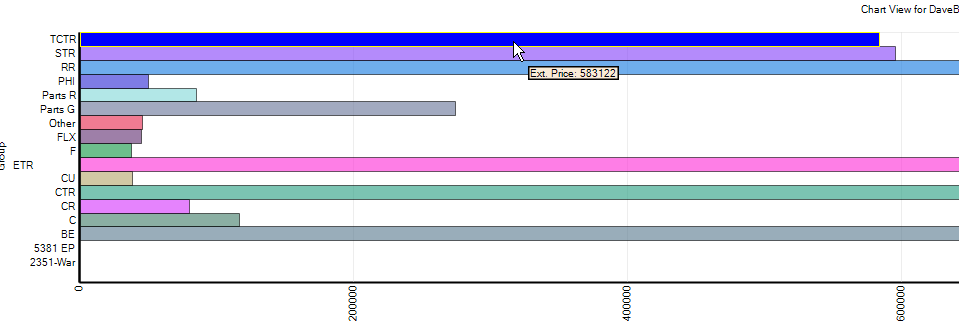
The charts on dashboards are quite limited unfortunately. The best I’ve been able to find is the the hover over the bar for a value as shown. Like @tfenwick11 said, the best solution is probably just to summarize on the grid.
until i upgrade our Epicor to the new 10.2.300 and see the new data analysis module, i would say the best option by far to construct metrics/ graphs is to create a comprehensive BAQ and either copy-paste its data or export it through REST to an excel file, then let excel functions/data model/pivot table and charts deal with all of that, and display what ever you want in single refresh click,