Good afternoon,
We are looking at the Resource Scheduling Board, and the Multi Resource Scheduling Board, but the jobs are hard to see on each day/resource. We would like to see a version of this chart that is legible. Has anyone achieved this either with the built-in features, or with your own customization?
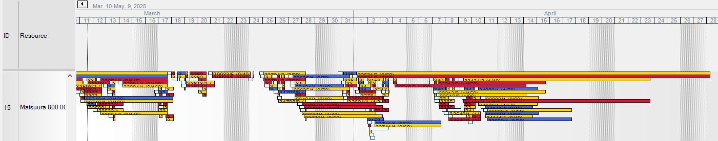
This is what it looks like when I look at a couple of machines in a resource group for two months:
I want to be able to see at least the entire job number, and ideally the operation/assembly codes as well. I have to stretch the timeframe to zoom in all the way to the hours level if I want the job bars to be long enough to fit in the details. I would also have to zoom way in on the y axis so the height of the bars are big enough to fit the job number.
What do you think? Is this a problem that has been solved?
Thanks for your time!
Nate
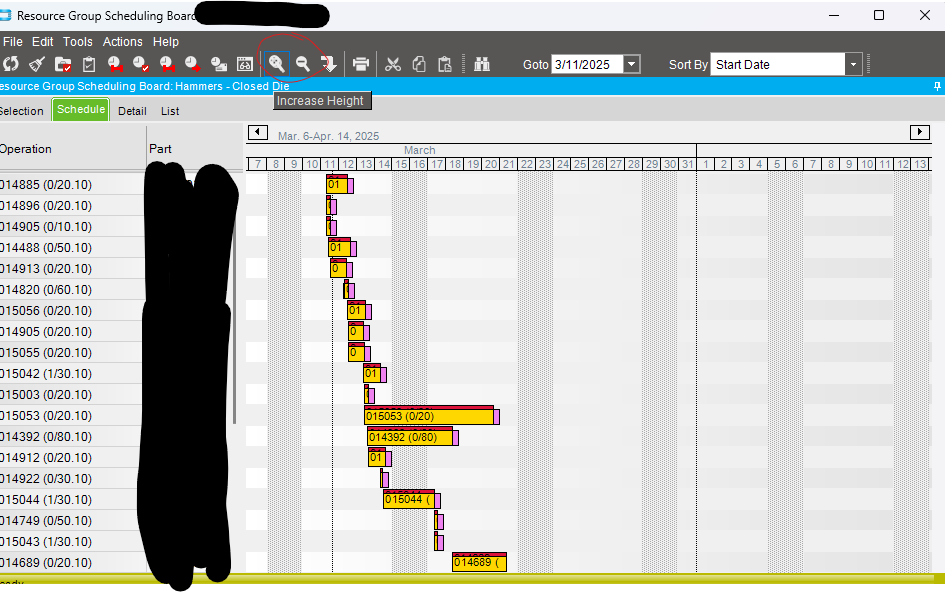
With Kinetic it is arguable way worse than classic. I can’t easily change the zoom scale (hours/days/months). I have to choose an existing option from the list. I can’t easily scroll back and forth to past or future dates. I have to specifically choose a date in the picker. I also can’t scale up the y axis enough to see all the details. It seems like it doesn’t show all the details anyway. Not nearly as much as the classic view shows.
Not too good either… If I could rearrange the order of the jobs on the display it would get closer to useful. Note, I don’t want to change the scheduled order of the jobs, just to see them in a sequence that makes sense. In the screenshot I have hundreds of jobs to scroll through. If I could see all the jobs in the order that they are starting it would make more sense.
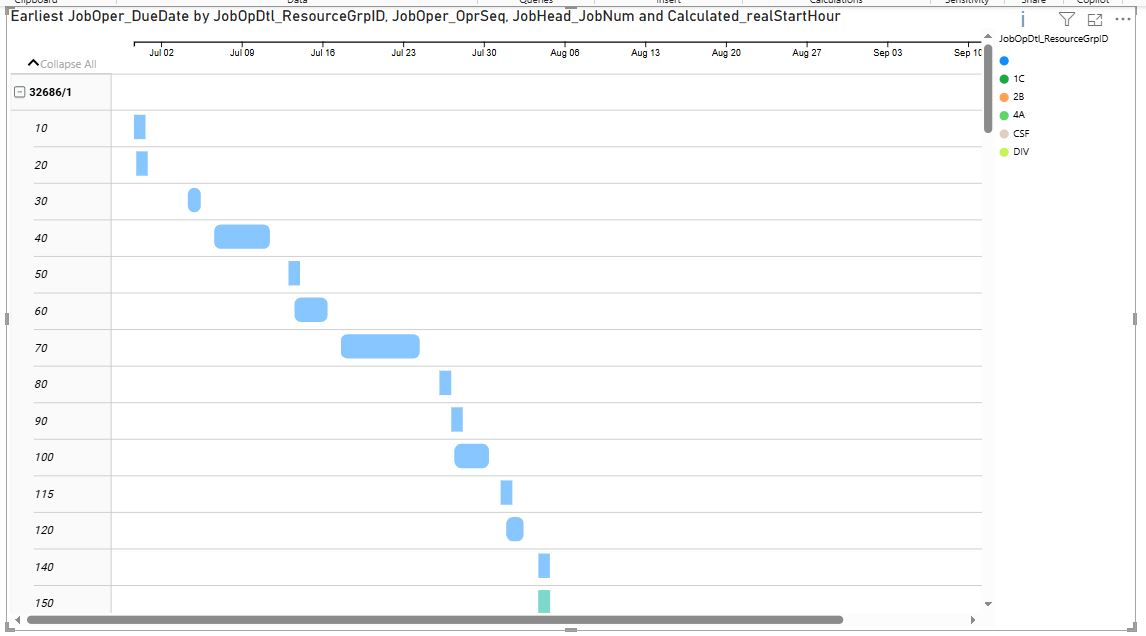
So, I pulled my operation data into a PowerBI visualization. Its not too bad, but it lacks a lot of the control i would want. Has anyone customized a visualization in Power BI? I am using the Microsoft Gantt Chart visualization (3.0.12.0)
If I could add in the assembly level, this might do the trick. Maybe if I combine the Job number and assembly level into a concatenated field then I could use that as the “job” grouping. I would prefer to learn how to deeply customize the visualization if it is possible. Thanks for your time!
Here I used the Job and assembly level for grouping:
EDIT: The biggest problem I am having is that the visualization is not designed to show all the records. The little i in the top right shows that I have too many records and I have to filter them down. But I want to see all my data in this format.
I am finding there is not any documentation about what each of the fields are used for when setting up the visualization. Anyway. This gantt chart is great!