Token Date
Allows a user to select a date value using a calendar or a tokenized date (such as Today, Tomorrow, Today+1, etc)
Helper function to convert the tokens to useable dates in App Studio
| Property Group | Property | Description |
|---|---|---|
| Basic | Id | Unique identifier for the control |
| Basic | Label Text | Sets the label within the control. (Fig. A) |
| Behavior | On Blur | Click this to create an OnBlur event for the control. On Blur is triggered when the control loses focus. |
| Behavior | On Create | Click this to create an OnCreate event for the control On Create is triggered when the control is painted to the GUI. |
| Comments | Comments | Add some developer notes to the control. These are not customer-facing and are only visible in App Studio (Fig. B) |
| Data | Key Field | Indicates that a bound component is a key field. If true, the field is enabled if there is no current record, allowing the user to select an existing record or create a new one. |
| Data | EpBinding | Bind the control to a DataView.Column. This is for the date value when the token is not used. |
| Data | EpBinding ShowToken | Bind the control to a DataView.Column. This is for the “Dynamic” checkbox that shows true or false towards using the token. |
| Data | EpBinding Token | Bind the control to a DataView.Column. This stores the token value. Example: &Today+1 |
| Layout | Alignment |  Sets the alignment of the control. Doesn’t work without some effort. In order for this to display anything, you need to set the width property which is not inherently available. You will need to do an OnCreate event and then use the property-set widget for the width. Then this will show some visible effect. (Fig. C) Sets the alignment of the control. Doesn’t work without some effort. In order for this to display anything, you need to set the width property which is not inherently available. You will need to do an OnCreate event and then use the property-set widget for the width. Then this will show some visible effect. (Fig. C) |
| State | Personalizable | If true, a user can personalize this component(hide/show) |
| State | Customizable | If true, a user can customize this component in child layers |
| State | Hidden | Hides the control from view. |
| State | Disabled | Disables the control. The control will not allow editing or focus. |
| State | Read Only | Makes the control read only so that it will not allow editing. The control can still be focused. |
| State | Auto Focus | When enabled, the control is automatically focused on creation. |
| Advanced | Token Value | Set the default token value. Example: &Today-1 to set the value to “Yesterday”. Pro Tip. Bind the EpBinding Show Token to a string field, then put a textbox bound to the same field to see the different token values when selected. |
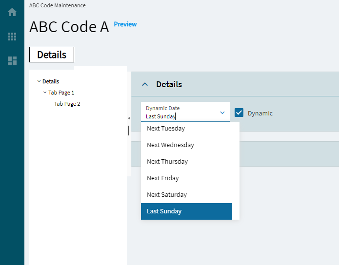
| Advanced | Show Token | Set the flag to determine if the token dropdown should be visible. (Fig. D) |
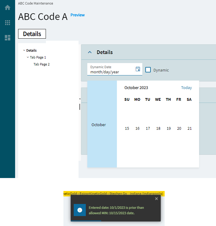
| Advanced | Min Allowed Date | Set the date’s minimum allowed value. (Fig. E) Note, this does not stop a user from setting a token that would go past that date. |
| Advanced | Max Allowed Date | Set the date’s maximumallowed value. (Fig. E) Note, this does not stop a user from setting a token that would go past that date. |
Figure A: Label Text
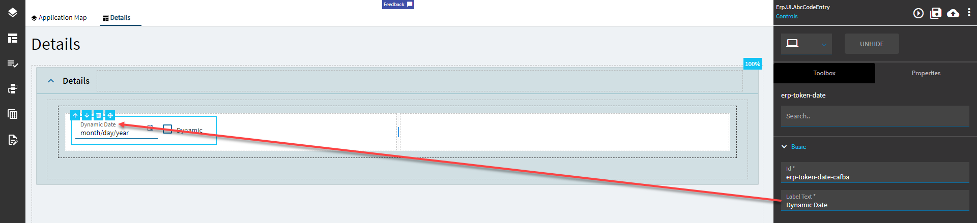
Figure B: Comments
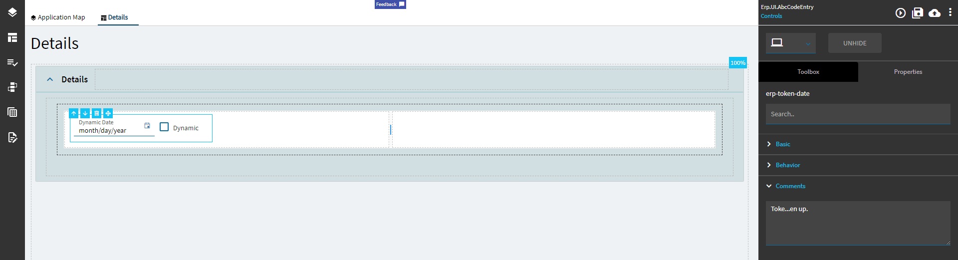
Figure C: Alignment
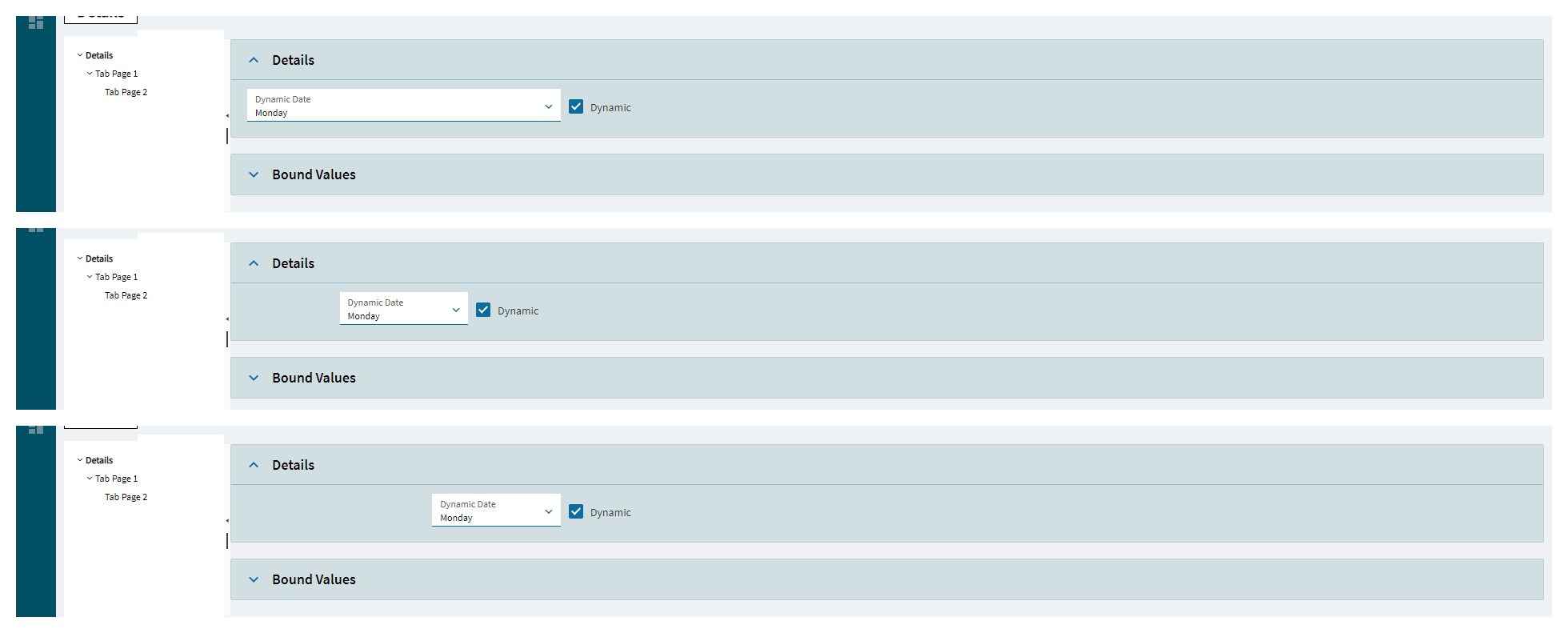
Figure D: Show Token
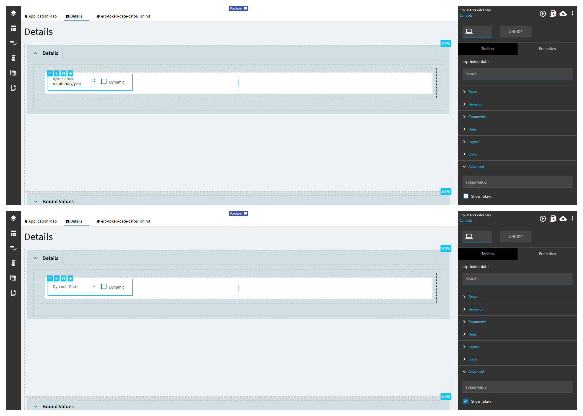
Figure E: Min/Max Allowed Dates