Checkbox
A checkbox is a control that allows a user to set a binding to true, false, or null (tri-state).

| Property Group | Property | Description |
|---|---|---|
| Basic | Id | Unique identifier for the control |
| Basic | Label Text | Sets the label next to the checkbox control. (Fig. A) |
| Behavior | On Blur | Click this to create an OnBlur event for the control. On Blur is triggered when the control loses focus. |
| Behavior | On Create | Click this to create an OnCreate event for the control On Create is triggered when the control is painted to the GUI. |
| Comments | Comments | Add some developer notes to the control. These are not customer-facing and are only visible in App Studio (Fig. B) |
| Data | Key Field | Indicates that a bound component is a key field. If true, the field is enabled if there is no current record, allowing the user to select an existing record or create a new one. (Fig. C) |
| Data | EpBinding | Bind the button to a DataView.Column. |
| Layout | Alignment | Set the alignment for the control. Valid options are Left, Center, Right. (Fig. D) |
| Layout | Width | Sets the specific width (pixels) for the control. (Fig. E) |
| State | Personalizable | If true, a user can personalize this component(hide/show) |
| State | Customizable | If true, a user can customize this component in child layers |
| State | Hidden | Hides the control from view. |
| State | Disabled | Disables the control. The control will not allow editing or focus. |
| State | Read Only | Makes the control read only so that it will not allow editing. The control can still be focused. |
| State | Auto Focus | When enabled, the control is automatically focused on creation. |
| State | Highlight Selected |
 Supposed to bold the label text when the checkbox is selected, but does not appear to be functional. Supposed to bold the label text when the checkbox is selected, but does not appear to be functional. |
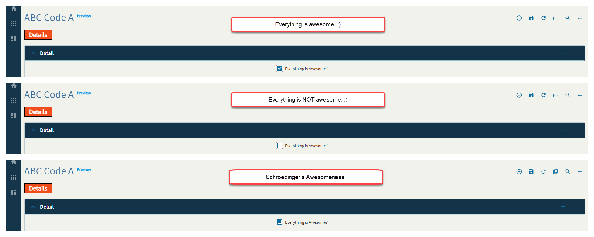
| State | Three State | Sets the control to be a tri-state control which allows for true, false, and null (all). (Fig. F) |
Figure A: Label Text
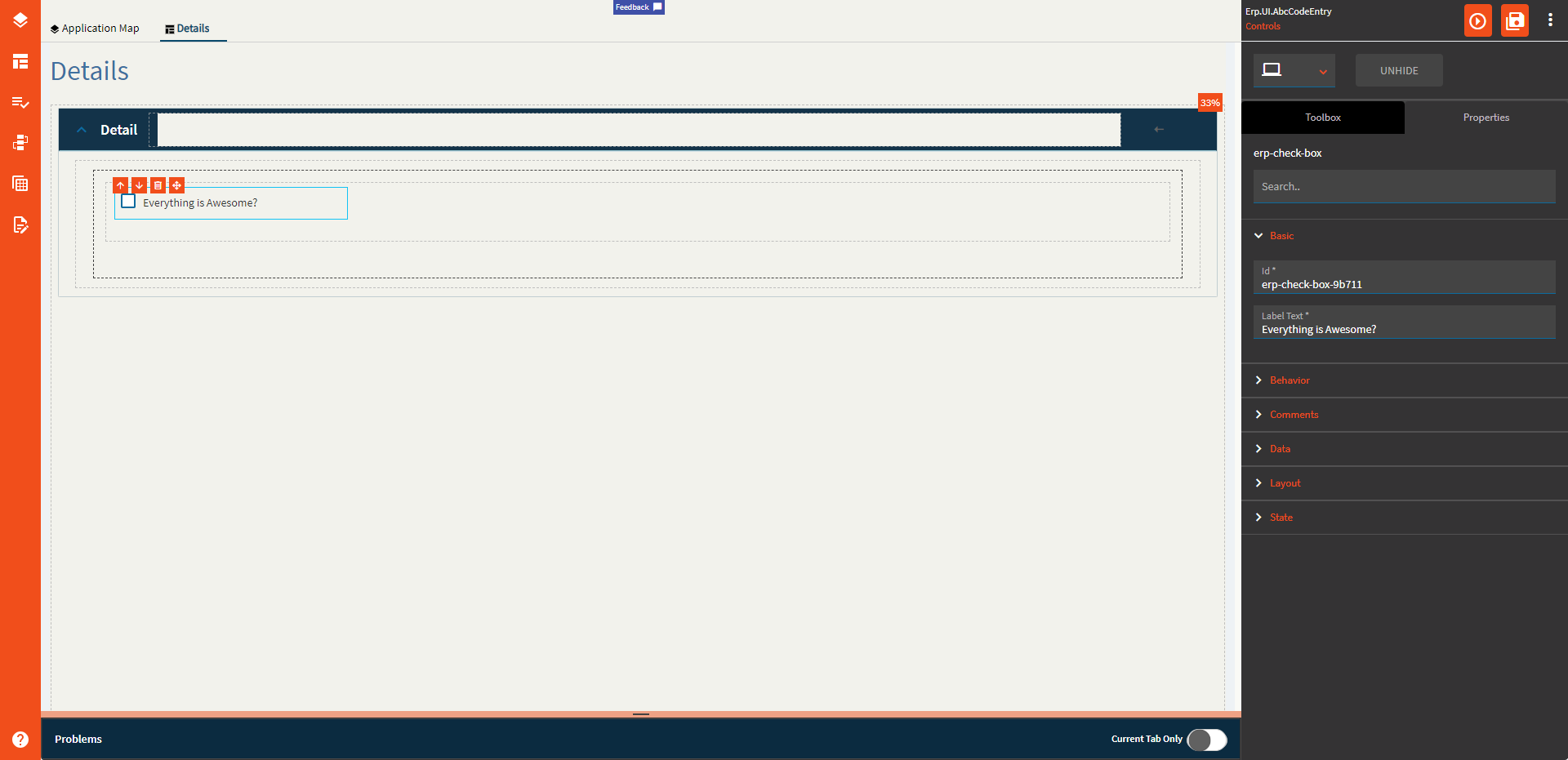
Figure B: Comments
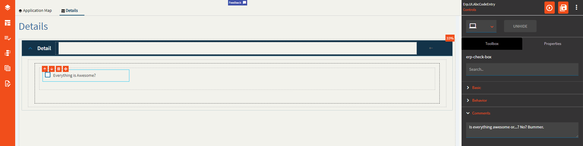
Figure C: Key Field
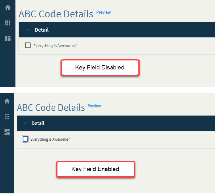
Figure D: Alignment
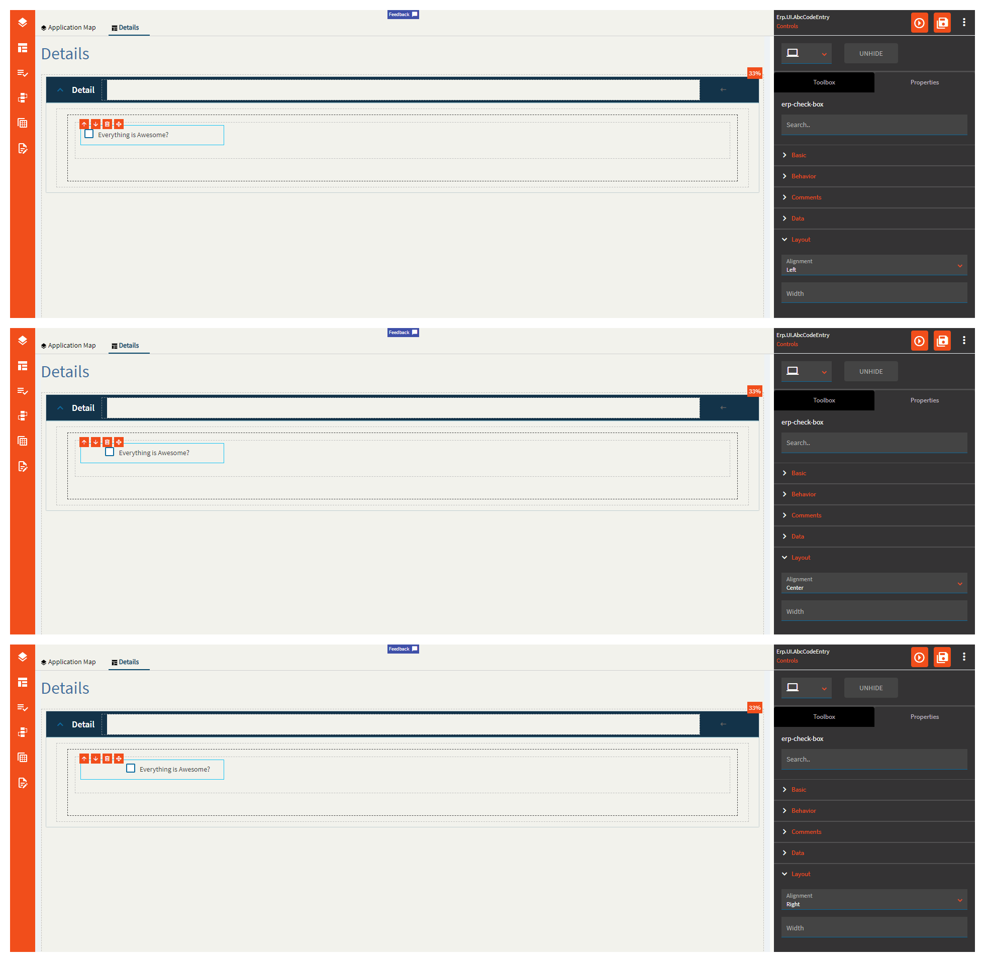
Figure E: Width
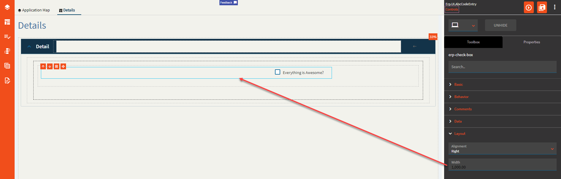
Figure F: Three State