Address Format
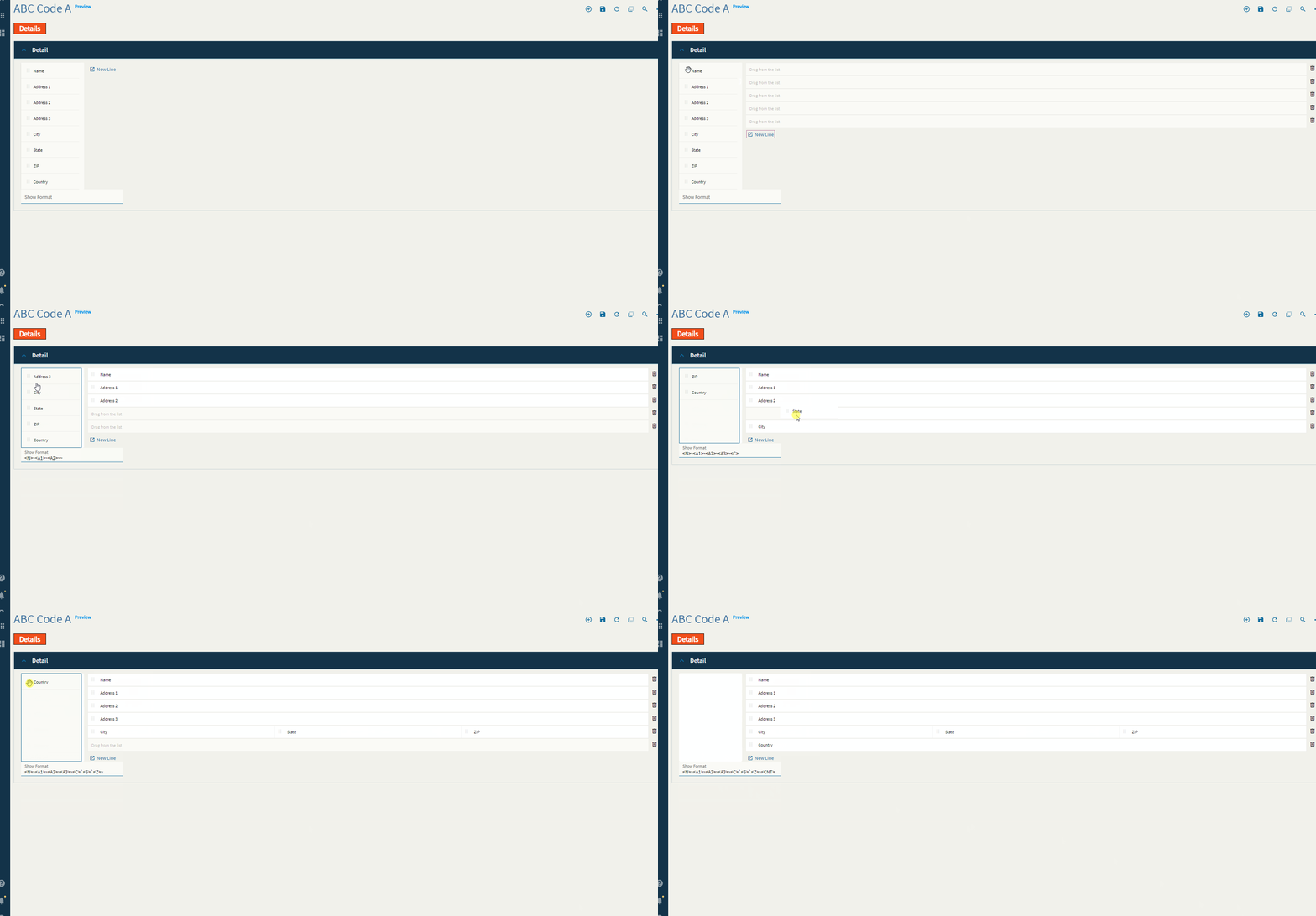
This component is used to define the format of an address. This is to be used in conjunction with some code/function to display the format in a text area properly.
| Property Group | Property | Description |
|---|---|---|
| Basic | Label Text | Typically used to give the component a header label, but this one does not appear to do much of anything. |
| Behavior | On Blur | Click this to create an OnBlur event for the control. On Blur is triggered when the control loses focus. |
| Behavior | On Create | Click this to create an OnCreate event for the control On Create is triggered when the control is painted to the GUI. |
| Data | EpBinding | This property is used to bind the data of the control to a DataView.Column such as TransView.AddressFormat. |
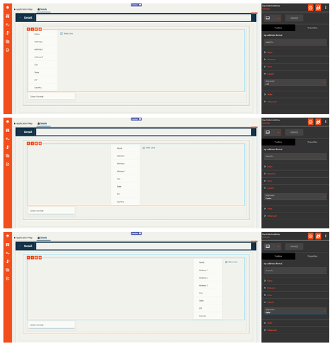
| Layout | Alignment | Set the alignment for the control (Zomg, this actually works! Most don’t). Valid options are Left, Center, Right. (Fig. A) |
| State | Hidden | Hides the control from view. |
| State | Disabled | Disables the control. The control will not allow editing or focus. |
| State | Read Only | Makes the control read only so that it will not allow editing. The control can still be focused. |
| State | Highlight Selected | Obsolete–this does nothing now. |
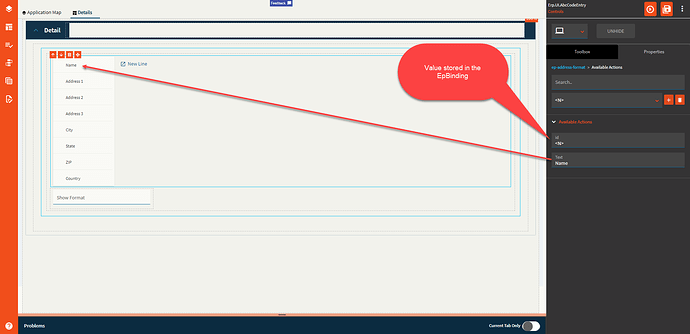
| Advanced > Available Actions | Id | Unique identifier of the list item. (Fig. B) |
| Advanced > Available Actions | Text | The text to show on the control. (Fig. B) |
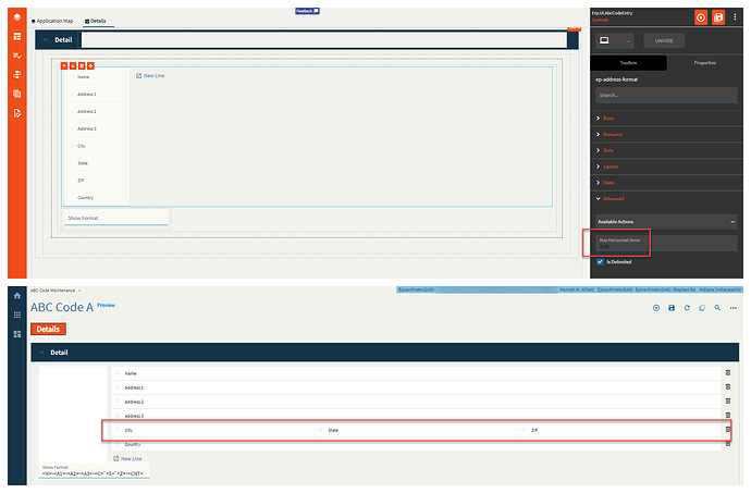
| Advanced | Max Horizontal Items | Integer value that allows control over how many items can show in a single line. (Fig. C) |
| Advanced | Is Delimited |
|
Figure A: Alignment
Figure B: Available Actions
Figure C: Max Horizontal Items


