GroupBox
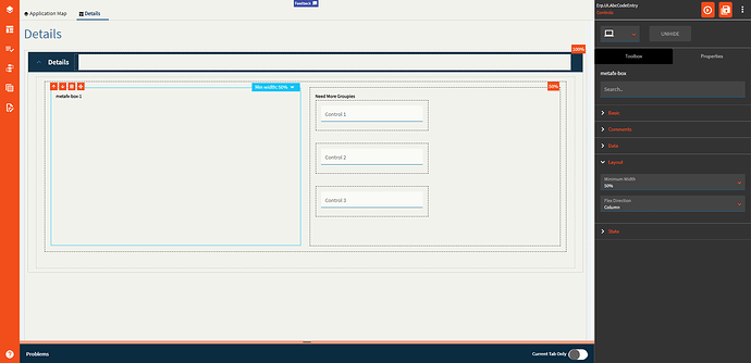
Use to group controls with an optional label so that they stay together as the UI responds to smaller screens.
| Property Group | Property | Description |
|---|---|---|
| Basic | Id | Unique identifier for the control |
| Basic | Label Text | Sets the Title of the group. (Fig. A) |
| Comments | Comments | Add some developer notes to the control. These are not customer-facing and are only visible in App Studio (Fig. B) |
| Data | Key Field |
|
| Layout | Minimum Width | Sets the minimum width the panel can shrink to when the page is in Flex Layout Mode. (Fig. C) |
| Layout | Flex Direction |
|
| State | Personalizable | If true, a user can personalize this component(hide/show) |
| State | Customizable | If true, a user can customize this component in child layers |
Figure A: Label Text
Figure B: Comments
Figure C: Minimum Width


