Container
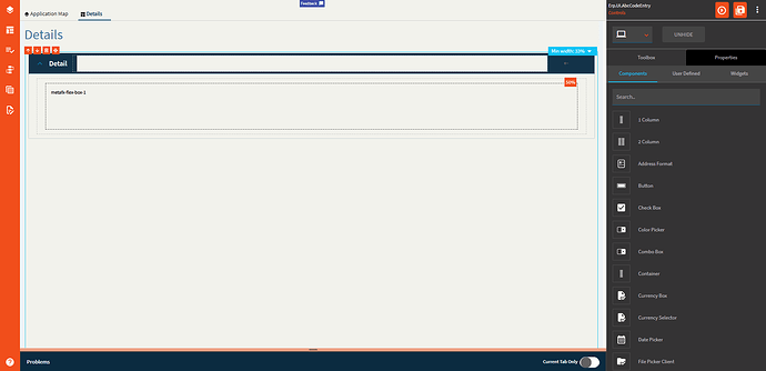
A container is a control that groups other controls together.
This is one of the few controls that can exist outside of a column control. Most other controls need to be placed within a column control.
| Property Group | Property | Description |
|---|---|---|
| Basic | Id | Unique identifier for the control |
| Basic | Label Text | Sets the label text within the control. (Fig. A) |
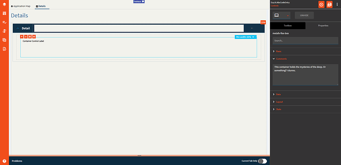
| Comments | Comments | Add some developer notes to the control. These are not customer-facing and are only visible in App Studio (Fig. B) |
| Data | Key Field | Indicates that a bound component is a key field. If true, the field is enabled if there is no current record, allowing the user to select an existing record or create a new one. Not relevant to this component |
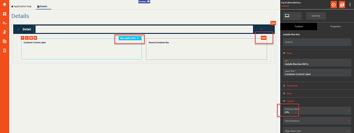
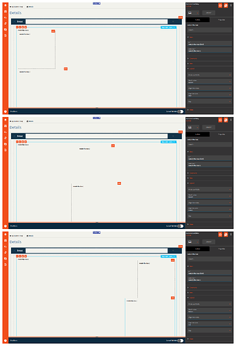
| Layout | Minimum Width | Setting this allows 2 or more containers to “flex” their size and show up side-by-side if the space is available. (Fig. C) |
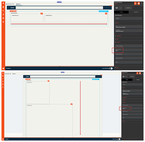
| Layout | Flex Direction | This defines the direction the controls (that can flex with a min width property themselves) within the container can flex. Values include Row (horizontal), Column (vertical), and Default (horizontal). (Fig. D) |
| Layout | Align Main Axis |
|
| Layout | Align Cross Axis | This aligns the controls on the vertical axis if the Flex Direction is “column”. If it’s set to “Row”, it just slightly shrinks the control. #Shrug. Valid options include Start, Center, and End. (Fig. E) |
| Layout | Gap |
|
| State | Personalizable | If true, a user can personalize this component(hide/show) |
| State | Customizable | If true, a user can customize this component in child layers |
Figure A: Label Text
Figure B: Comments
Figure C: Minimum Width
Figure D: Flex Direction
Figure E: Align Cross Axis
